Ridiculous.
It seriously is, ridiculous, seeing the lapse of updates that I have on this blog as opposed to elsewhere (winks).
This here is a logo I designed for the upcoming uni-hockey competition to be held in Singapore.
The Logo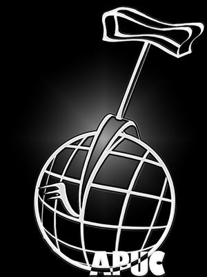
After MUCH procrastination, I finally did it, much to the dismay of Maxim, and Jiahui at Maxim's incessant badgering.
But hey, for say a few hours of work it turned out nice, eh? And to think I had to make more than one for selections. But seriously this wasn't the one I wanted to make and use. I had in mind on of a silhouette of a unicyclist in a rounded triangle, but because I cannot draw for nuts, much less with a mouse, it turned out horribly terrible. So this was the better effort, simply because, it's stylized lines. I think I have an affinity with them. They seem to work for me.
Of unworthy note, the words were originally APACHC, which makes no meaning anyway. Not that APUC does, also.
And for a remembrance's sake, here's a historic one.
OMGness
OMG I can't believe I once made something like that.
Seriously.
![]()
No comments:
Post a Comment